Visual Branding for Plantwalk —Herbal Infusions Rooted in Slow Living
Some brands you photograph and some brands you feel. Plantwalk is the latter.
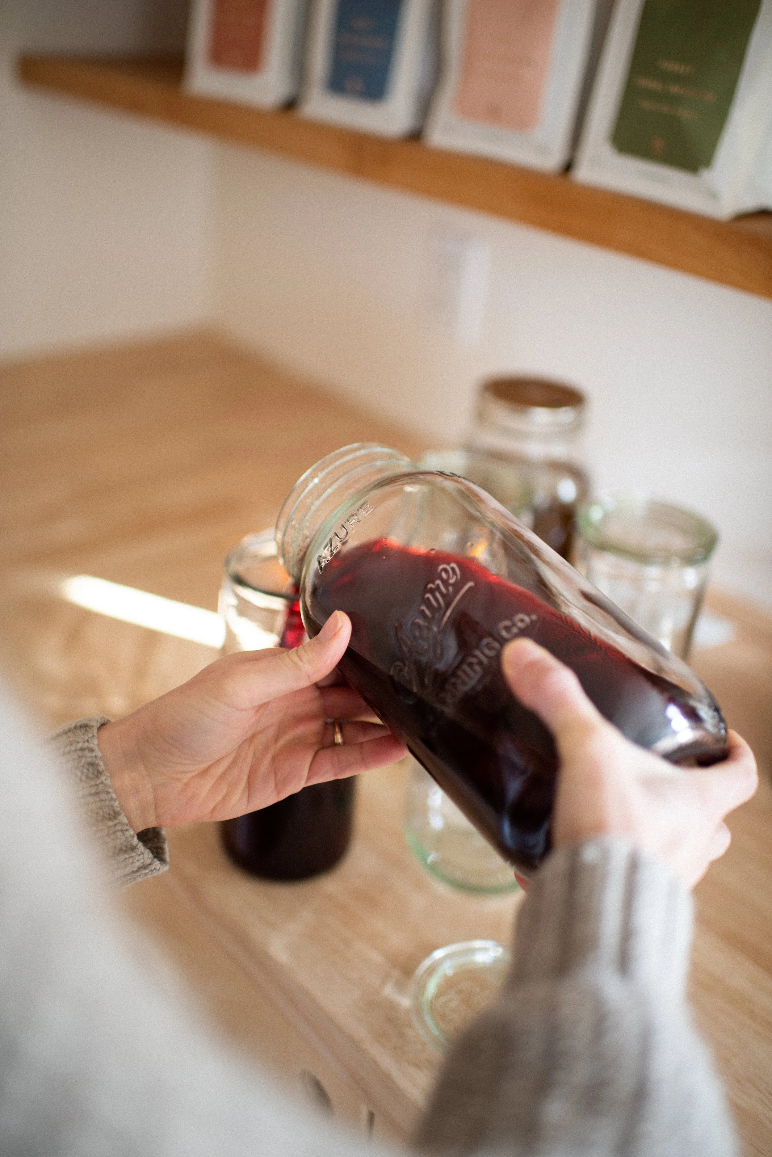
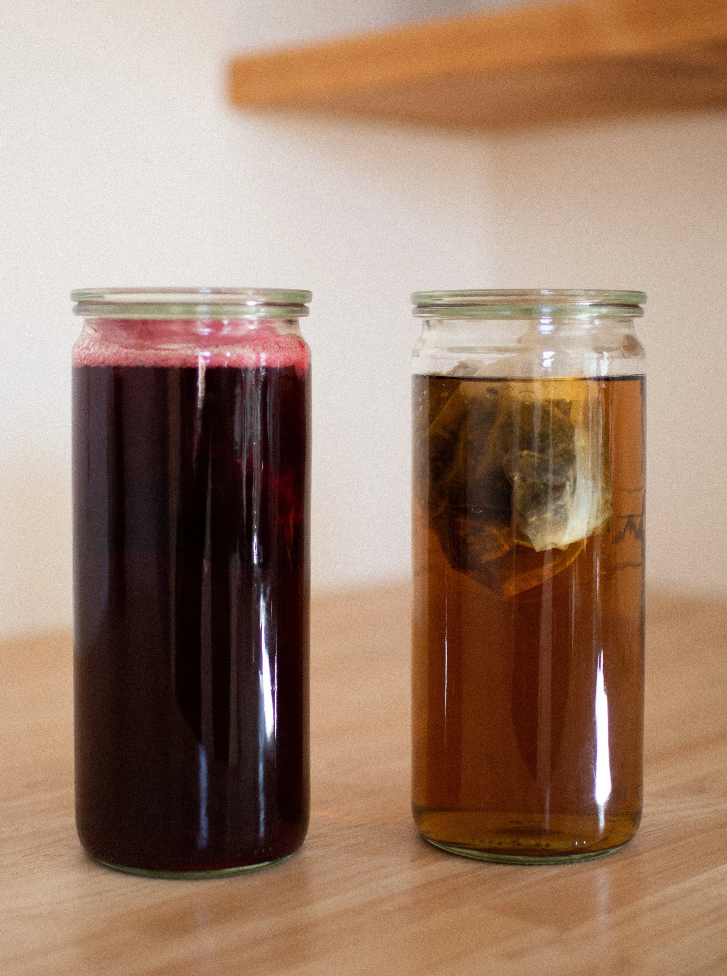
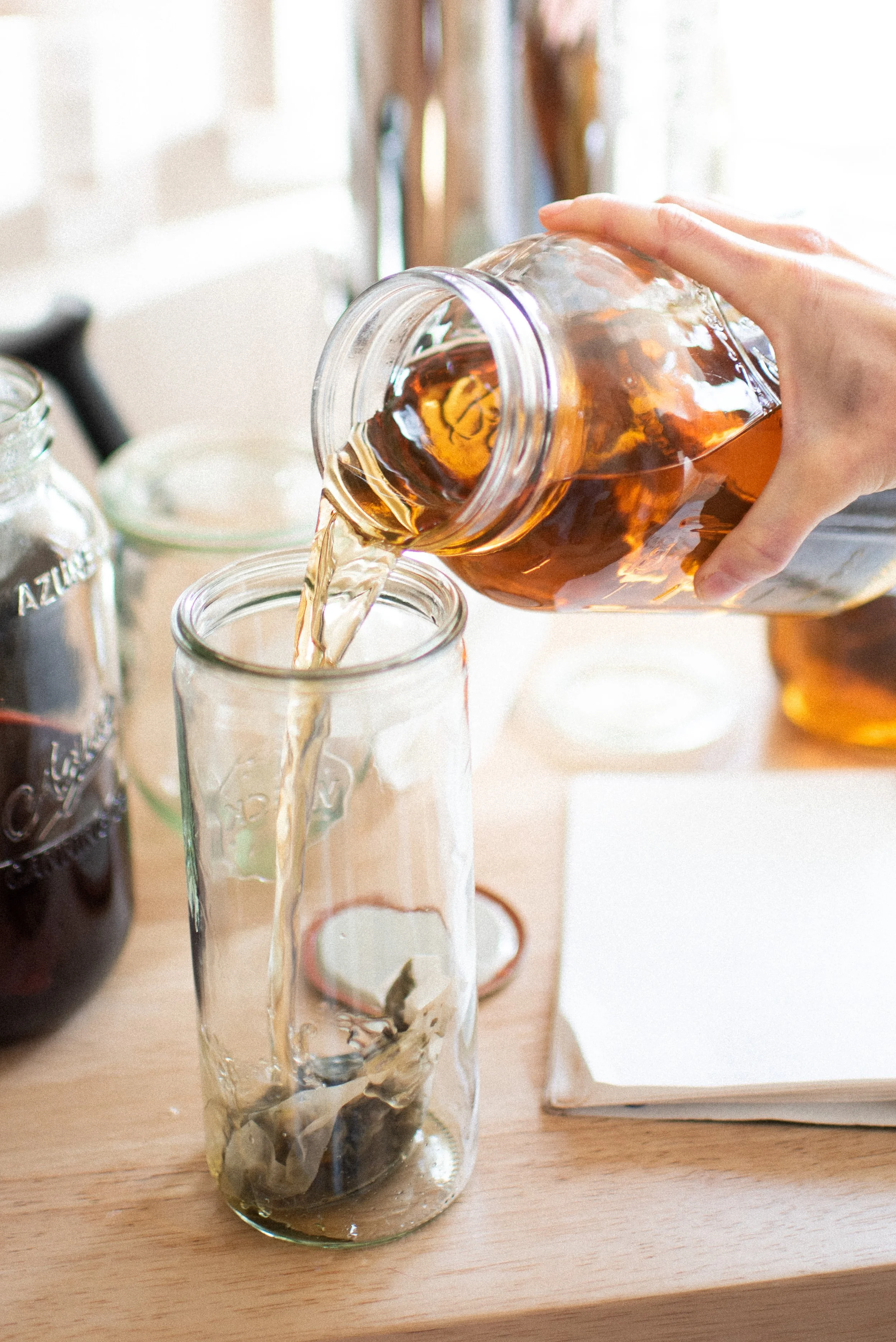
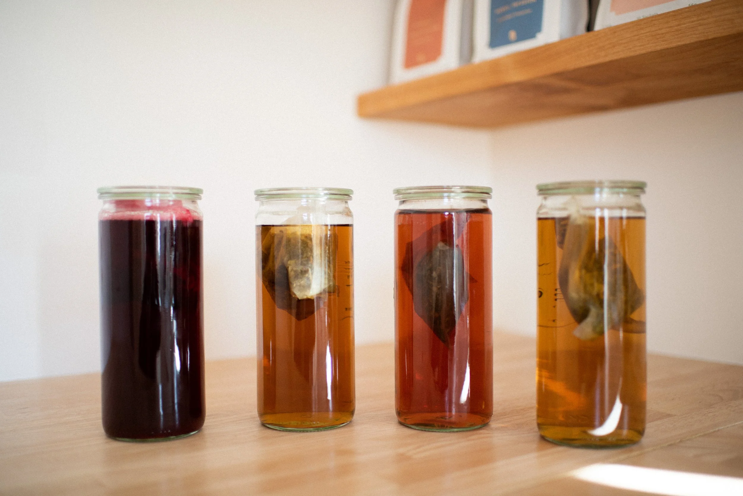
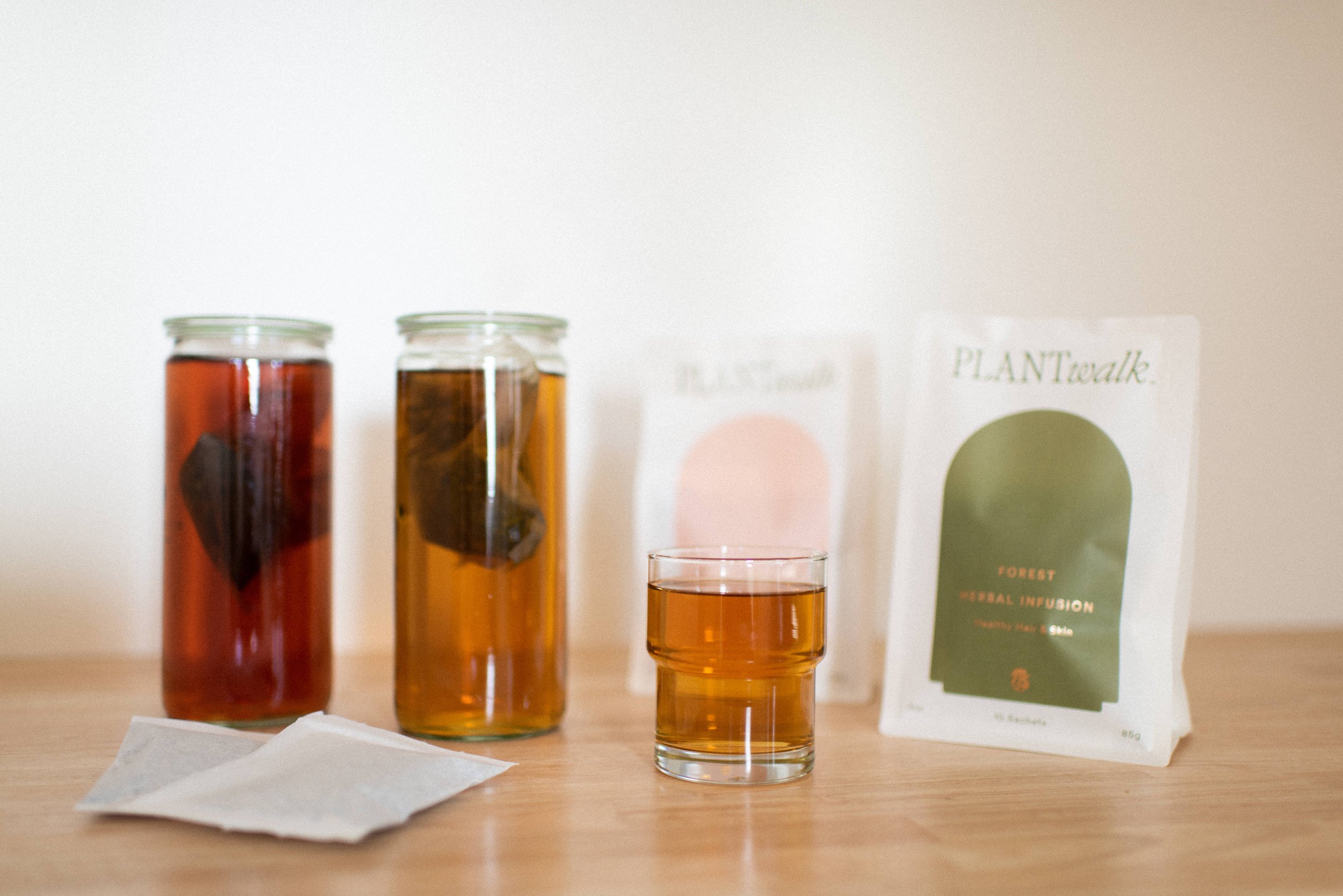
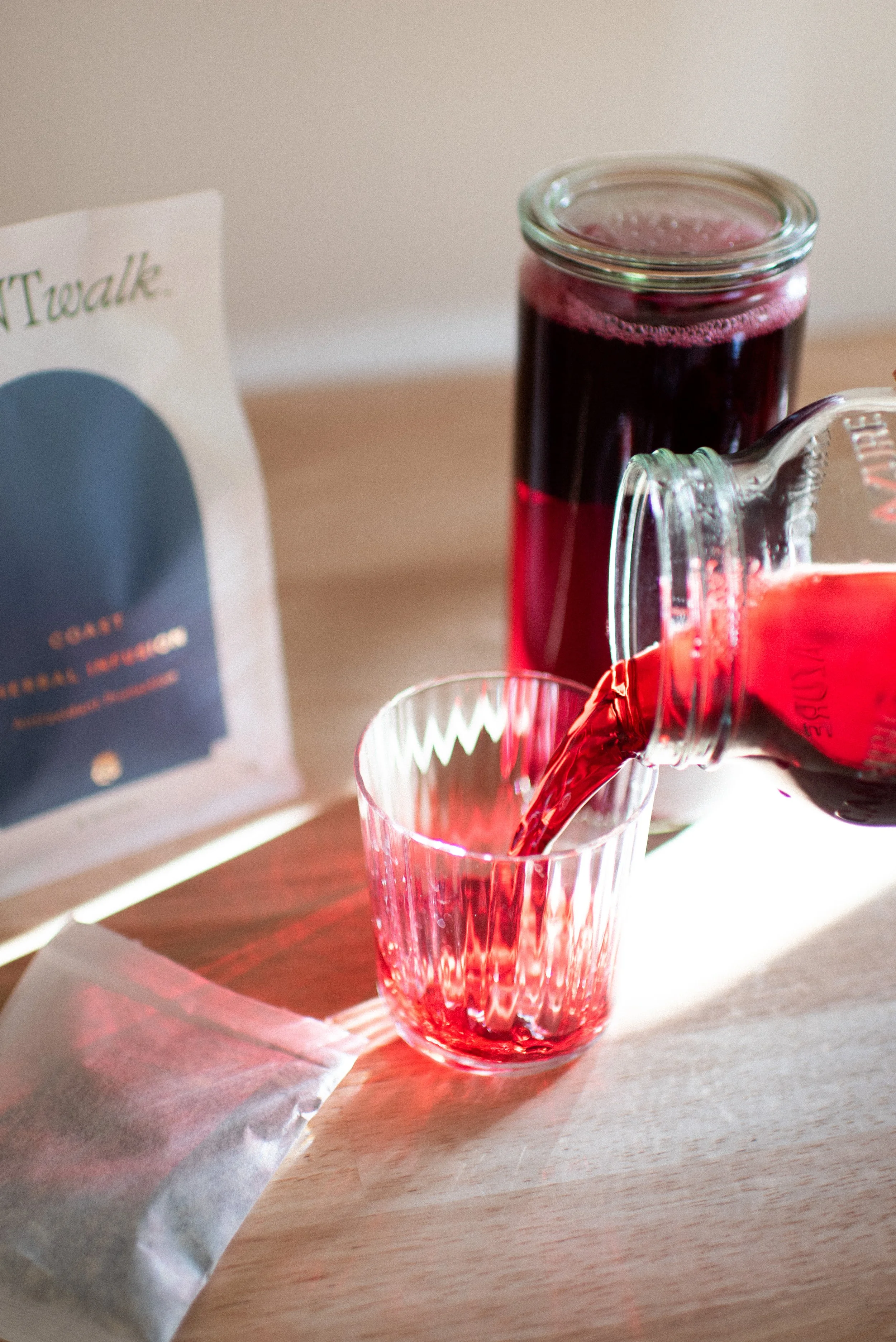
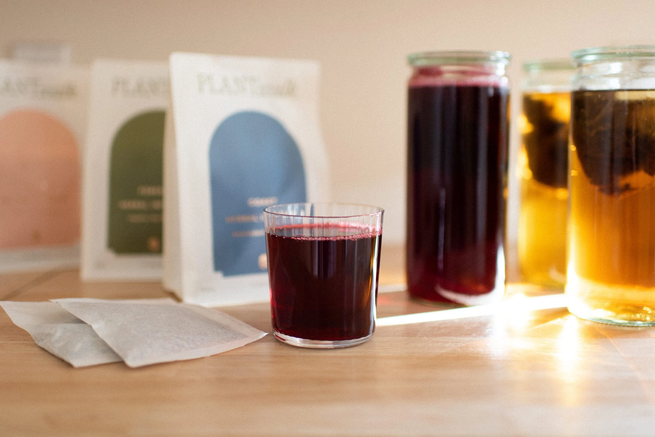
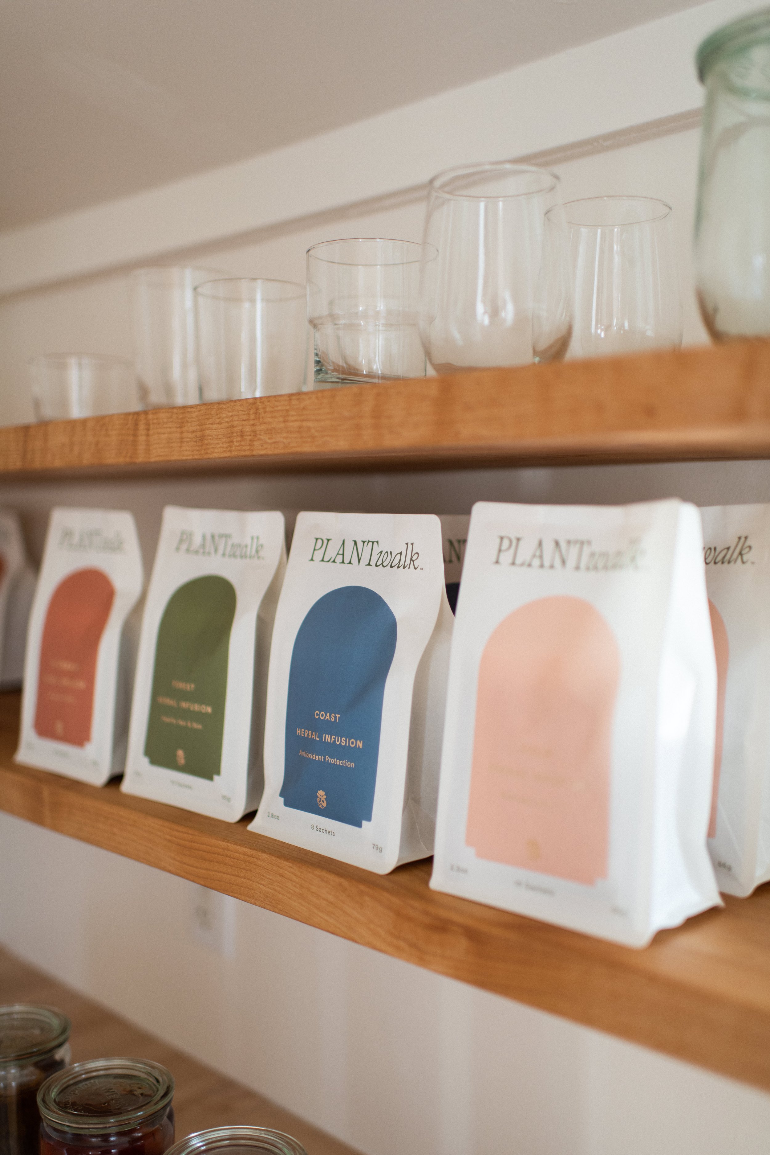
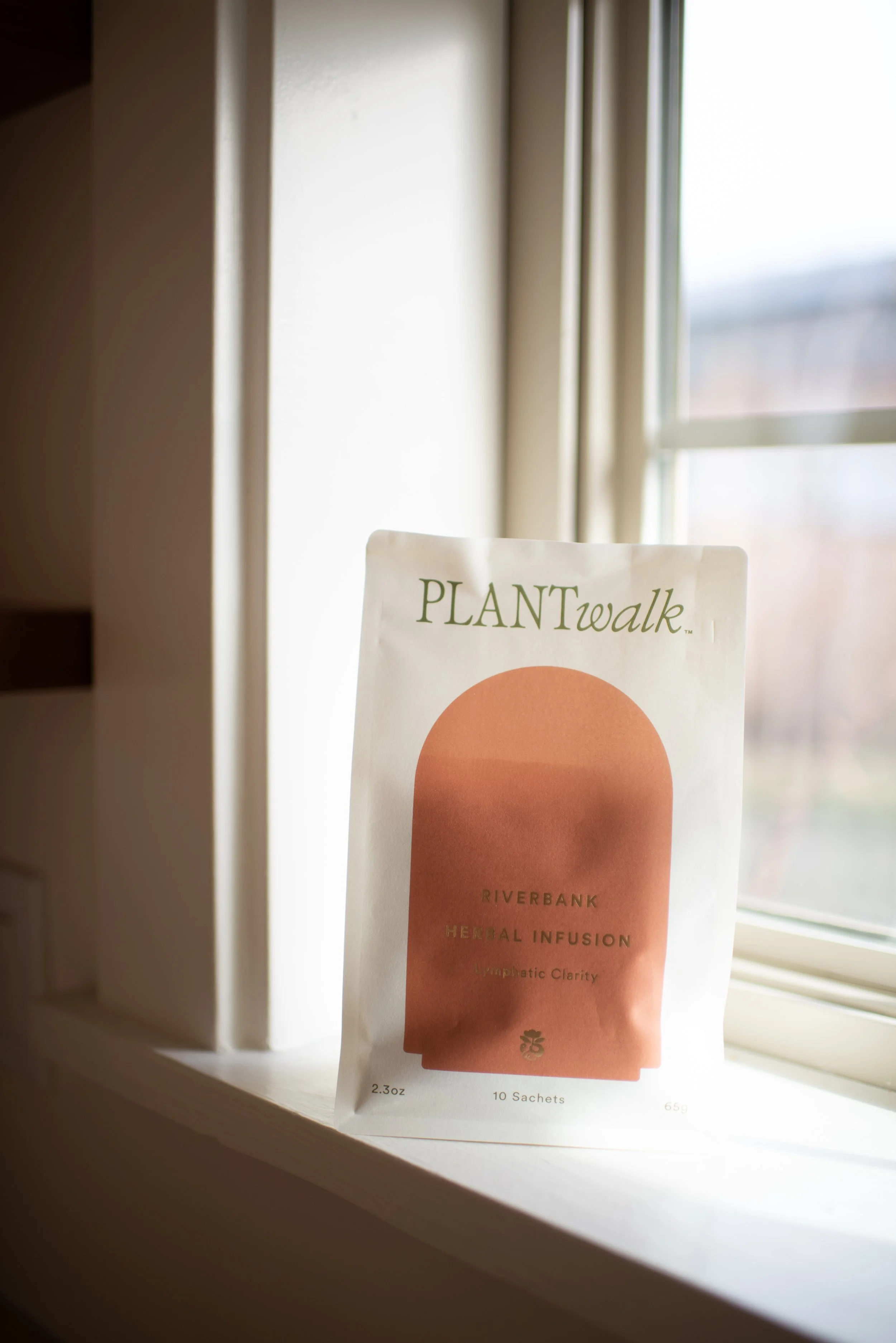
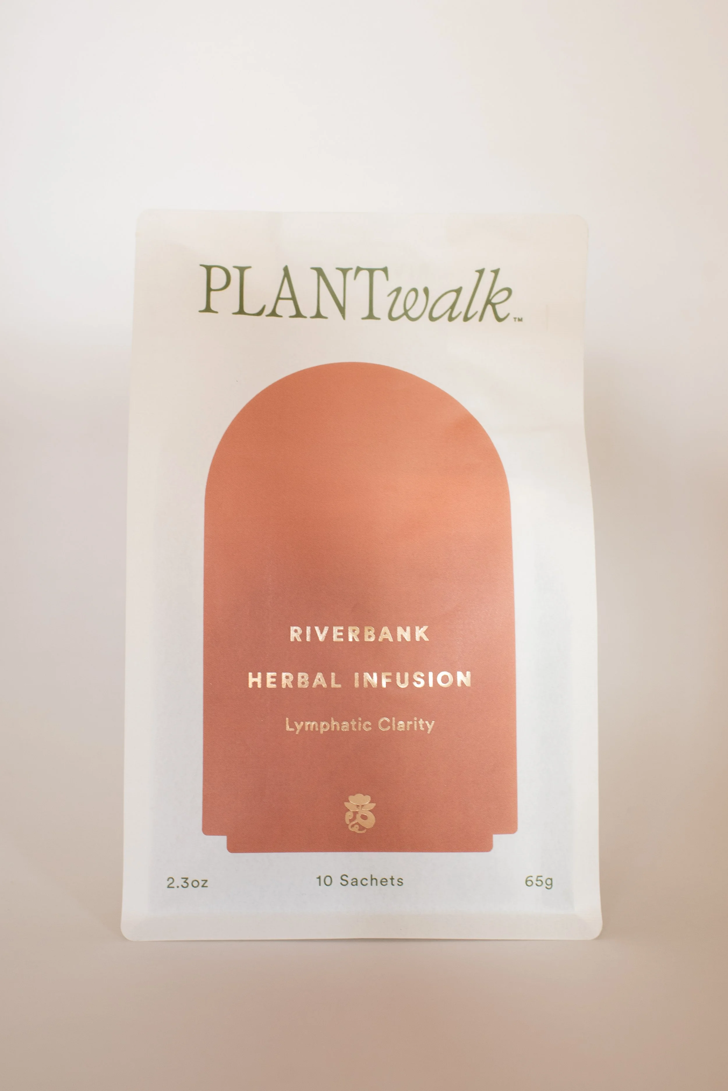
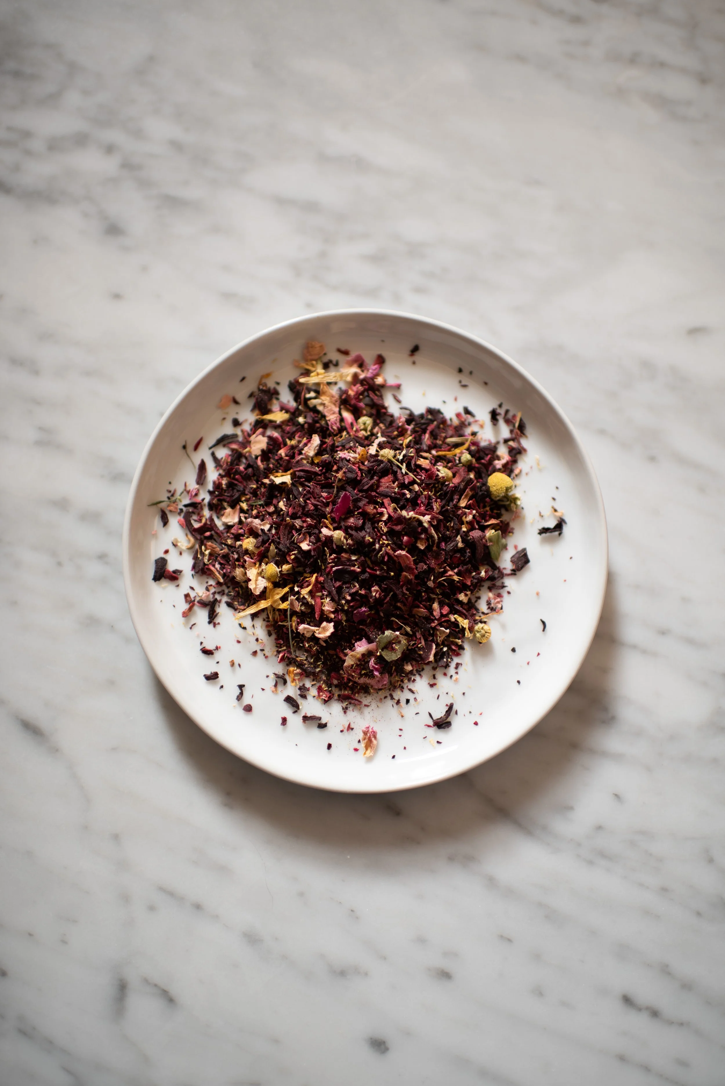
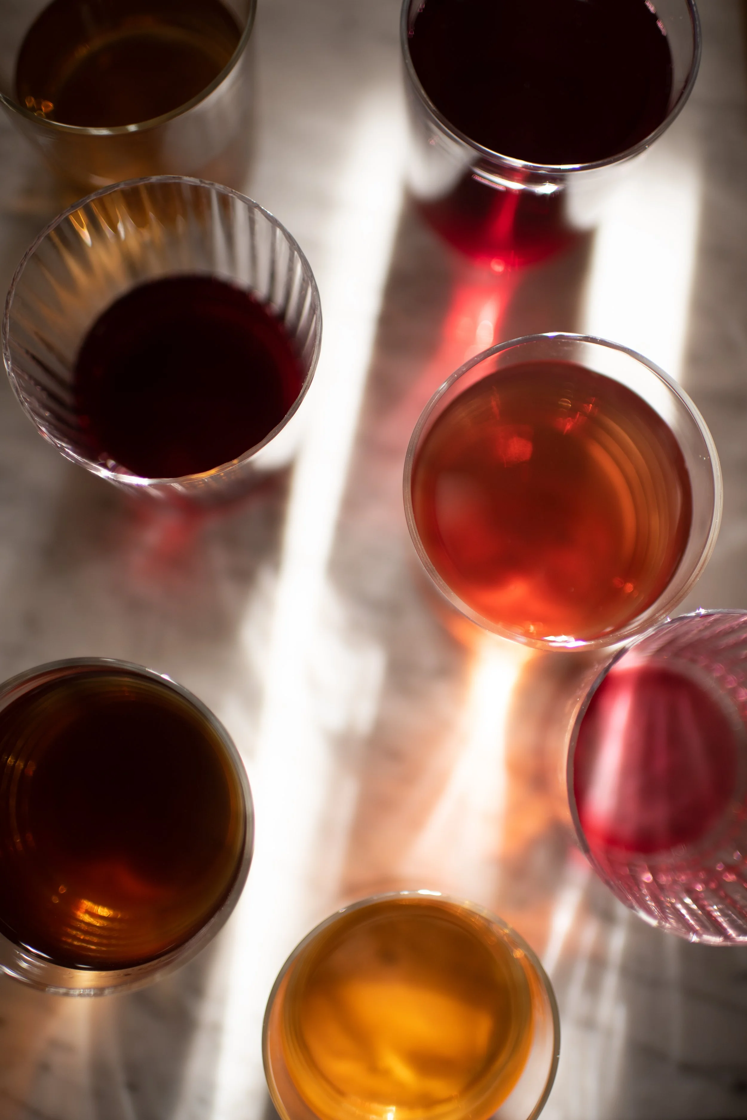
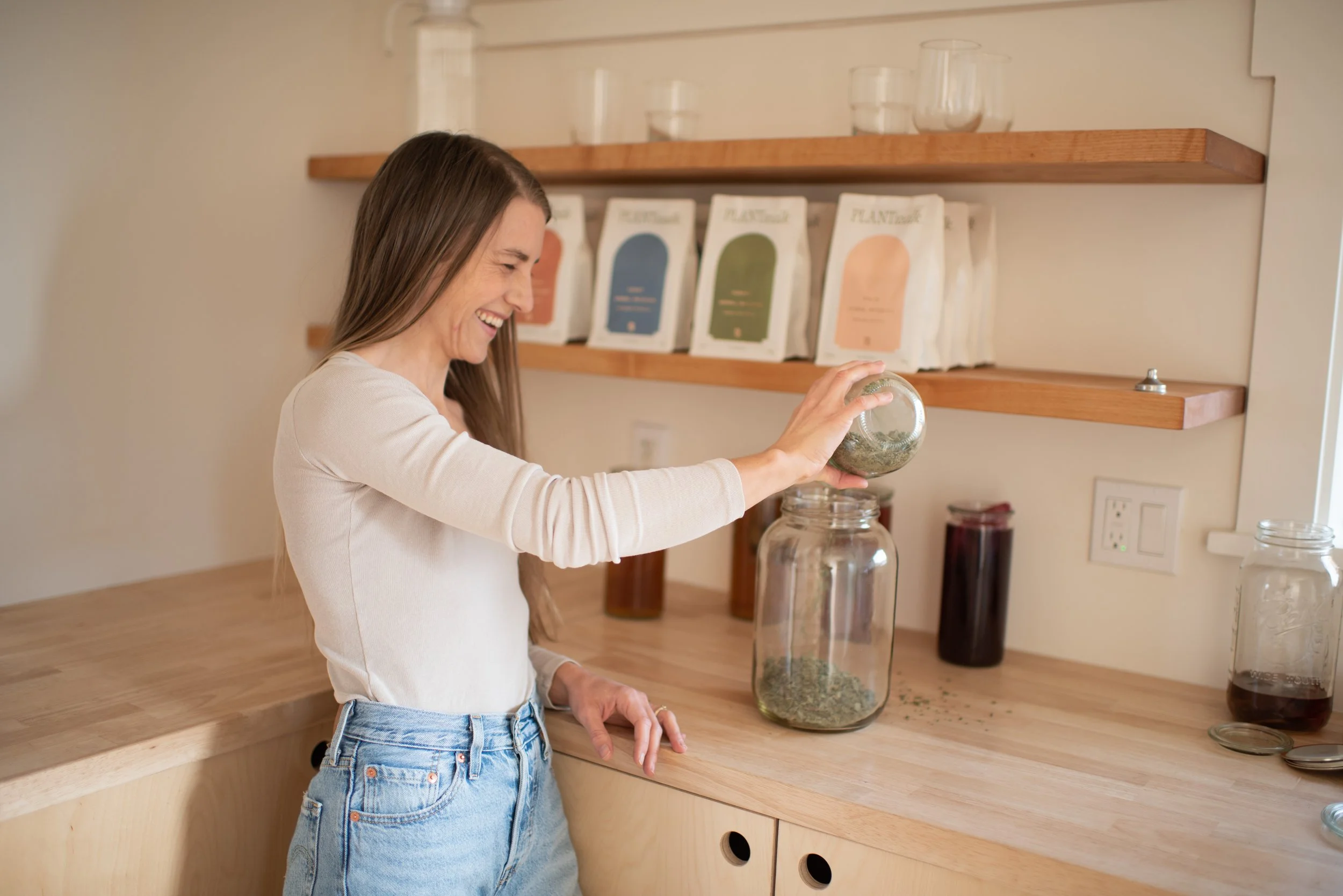
Founded by naturopath and mother Emily Wiggins, Plantwalk is built on a simple, profound belief — that plants can nourish and restore us, and that the ritual of herbal infusions doesn't have to be complicated to be meaningful. Her herbal infusion blends — Riverbank, Field, Coast, and Forest — are mineral-rich, long-steeped, and prepared in the tradition of folk herbalism.
When it came to creating the visual identity for Plantwalk, that philosophy had to live in every single frame.
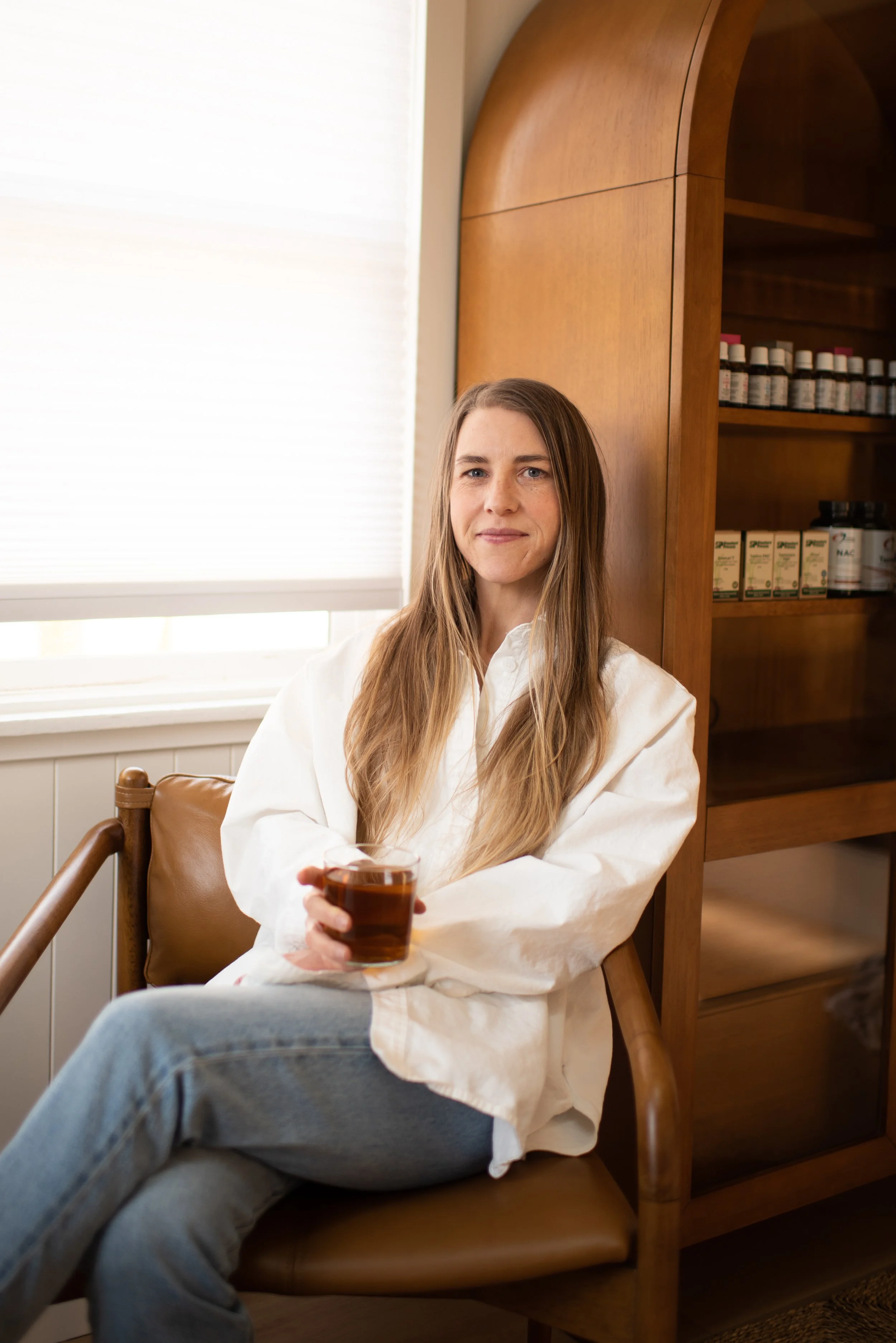
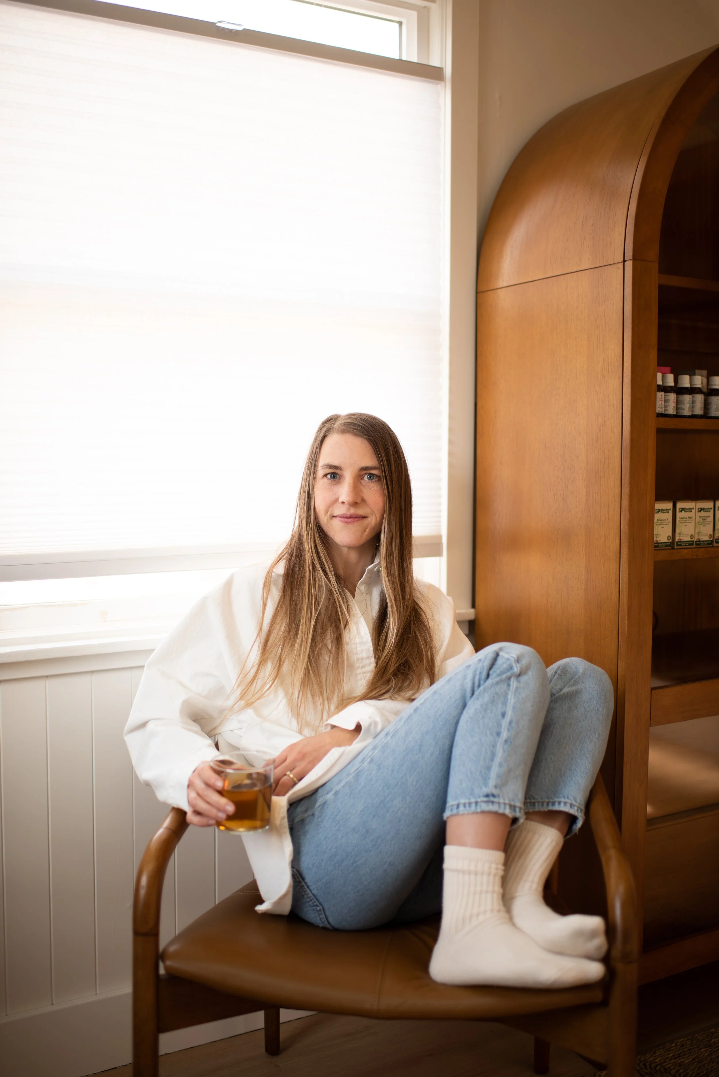
My approach was to let the brand's ethos drive every creative decision. Plantwalk isn't loud. It isn't trend-chasing. It's the opposite — grounded, quiet, deeply intentional. So the imagery needed to feel the same way. Natural light. Organic textures. A color palette pulled straight from the earth. Nothing extra. Nothing rushed.
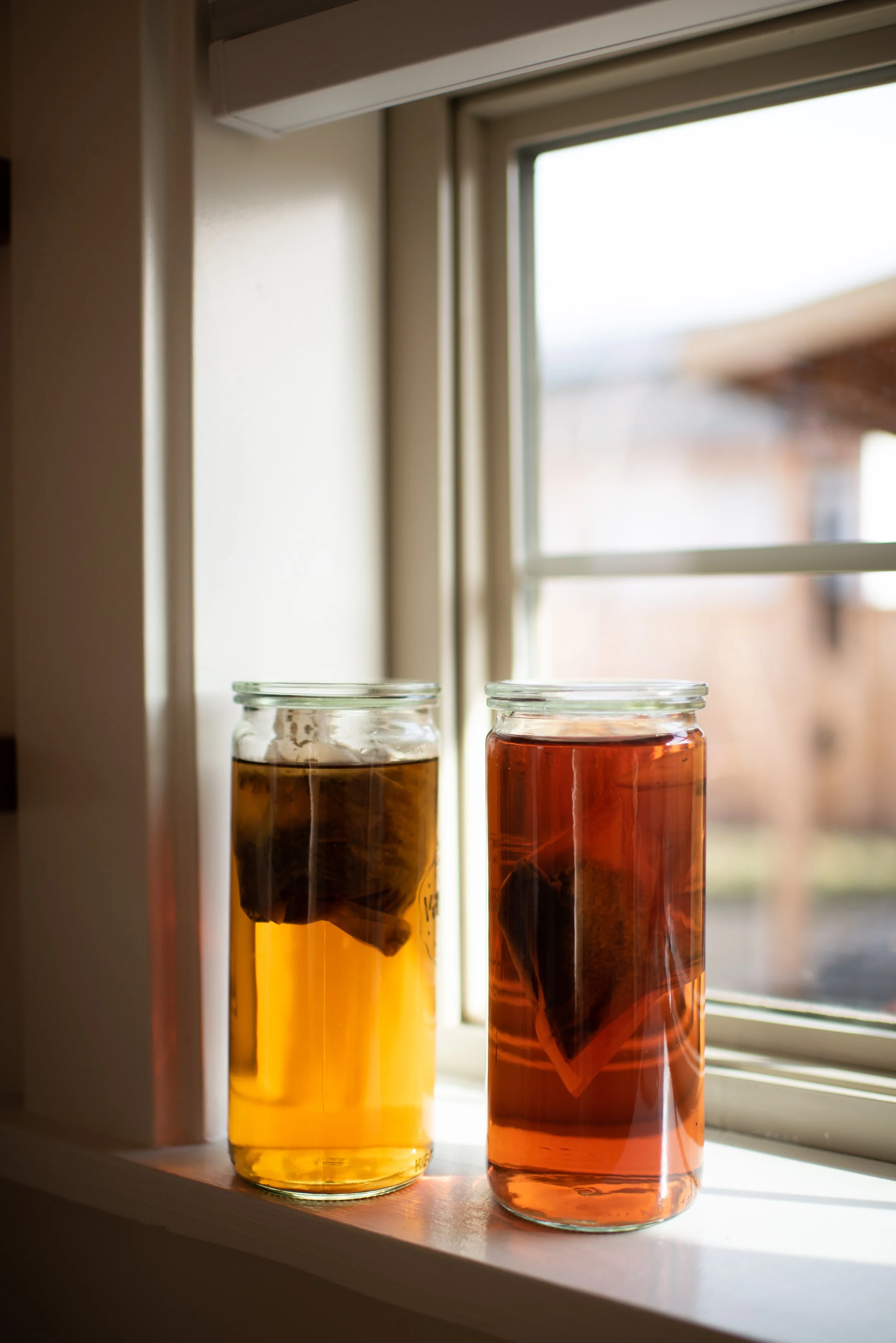
We photographed the four signature blends both as products and as living things — sachets steeping in water, herbs laid against linen, hands holding warm vessels. The goal was always to close the distance between the product and the feeling it creates. To make someone look at an image and already feel hydrated. Already feel nourished. Already feel like they've slowed down.
Emily built Plantwalk for the mother who wants to do something good for her body but doesn't have time to become an herbalist. For the person who has always been drawn to plants but didn't know where to start. That customer needed to see themselves in the imagery — not a curated, unreachable version of wellness, but something warm and real and within reach.
Plantwalk herbal infusions are available at plantwalk.co. If you're a wellness brand looking to build a visual identity that feels as intentional as your product, I'd love to hear from you.